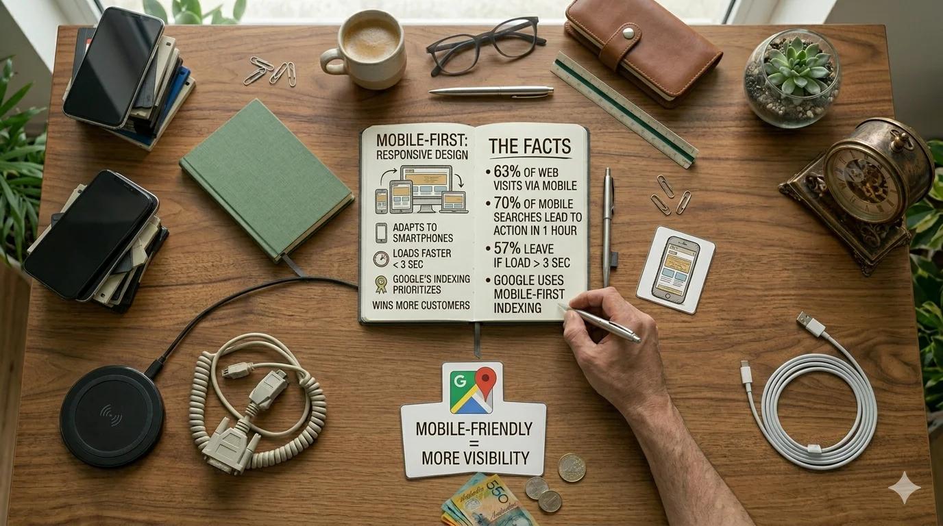
It used to be that the desktop version of a website was the main thing and the mobile version was the afterthought. Today it's the other way round, and not since yesterday. Anyone who builds a site without thinking about phones first is building for a minority.
I'm not going to come at you with statistics. There are plenty of numbers out there, all pointing the same way — most visits are mobile, many local searches end in an action within an hour on a phone, Google has indexed the mobile version first for years. The question isn't whether mobile matters. The question is what you do with it.
Mobile-first is thinking, not just building
Most people hear "mobile-friendly" and think: a site that looks okay on a phone. That's the minimum, not the goal. Mobile-first as a mindset means: you start at the phone and expand out to larger screens, not the other way round.
Why it matters: when you plan for the small screen, you make decisions. What actually goes on the homepage? Which navigation items are important enough to sit at the top? What has to be immediately readable, what can live in an accordion?
When you plan for desktop and then "adapt for mobile", you end up squeezing a desktop idea into a small format. The result looks responsive but feels like a folded brochure.
The things that actually frustrate
From working on existing sites — these are the problems I see most often:
Text you have to zoom. If the font on a phone is so small that the reader has to pinch-zoom to read a paragraph, it's too small. 16 pixels is the minimum for body copy. Anyone going below that for design reasons is trading legibility for aesthetics.
Buttons too small for fingers. Cursors are precise. Fingers aren't. A button smaller than 44 by 44 pixels is a gamble on a phone — if you hit it, you also hit the one next to it.
Hover as the only interaction. There's no hover on a phone. Anyone who reveals important information only in a hover tooltip hides it from half their visitors.
Pop-ups blocking the screen. Cookie banners, newsletter pop-ups, chat widgets — all at once, all layered. The page loads and the visitor sees nothing of the content. Google penalises this explicitly now.
Forms that don't work. Fields that disappear on iOS, autofill putting in the wrong data, required fields with no error message. Try your contact form on an old Android device.
Load time is the non-negotiable foundation
Before we talk about pretty mobile design: how fast does your site load on a phone? Not on your office wifi. On an average mobile network, with a two-year-old device.
Most website owners don't know their load time. I ask regularly, and the most common answer is "no idea, fast enough". When they actually measure, they're often surprised.
Three seconds is a good target for first render. Anything longer loses visitors — and not the impatient ones, the normal ones. A page that takes five seconds to load doesn't "have a five-second load time", it has a bounce rate that makes it invisible.
What really drives load time is usually images (too big, wrong format), scripts (tracking, chat, cookie banners, all loading individually), and bad hosting. The solution is rarely "build a faster site" — it's "remove the few things that are slowing it down".
Touch isn't a mouse
Sounds obvious, but the consequences are real. Fingers don't have pixel-precise positioning. They have thumbs that reach up to the screen from the bottom. They have moisture, gloves, cracked screens.
What this means for a website:
- Click targets big enough — 44 pixels is a minimum, not a maximum.
- Enough space between clickable elements so a finger doesn't hit the wrong one.
- Important buttons in the lower screen area, where the thumb naturally sits. Not at the top, where you have to stretch.
- No interaction that only works on hover. Every piece of information, every action has to be reachable without a mouse.
What "mobile-friendly" really means
Google has a test called "Mobile-Friendly" that gives you a label. The label is the minimum. It says: your site loads on a phone, the text is legible, the buttons are big enough, the menu works.
That's the baseline, not the goal. A site can be "mobile-friendly" and still frustrating. The question you should care about isn't: "Does it pass the Google test?" It's: "When someone searches for my service on a phone, clicks through to my site, and wants to send an enquiry — how many manage without giving up?"
No automated test answers the second question.
Test, don't assume
The most important thing last: test your site on a real phone. Not in a browser window on your MacBook where you drag the size down. On a real phone, on real mobile data, somewhere you don't have your office wifi.
Ideally on two: a current iPhone and a cheaper Android device from the last year. What runs fast and smooth on one stutters on the other. What reads fine on one breaks on the other.
If you know someone who's not technical — your mum, your neighbour, a friend — hand them your phone and say: "Find the phone number and call it." If they tap within five seconds, you've won. If they're searching, you have work to do.
Mobile-first isn't a checklist you work through once. It's the habit of looking at every decision first through the lens of the phone. Anyone who does that consistently builds sites that aren't just "responsive" but that actually work where people are: on the move, with their thumb, impatient.